


Issue 19: The story of the cover (and the story ON the cover!)
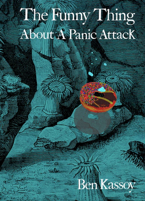
A deep sea donut…but where are the bubbles?
Helloooo, Strawberries!
As you may recall from the last newsletter and the one before that, I’m starting a lil’ sub-series called “A Deeper Dive, A Delicious Donut” where I delve further into the themes of, and the process behind, The Funny Thing About A Panic Attack.
In this week’s edition, I’d love to share the story of the chapbook’s cover – and the story on the chapbook’s cover. So…here we go!
In February 2022, I completed my full 55-page manuscript and began submitting it to publishers. A mentor of mine told me his manuscript was rejected for 18 months; another friend, who’s an award-winning poet, told me it took her seven years(!!!) to get her first book accepted. So when I started submitting, I was bracing myself for a long road of rejection. BUT, the very next month, March 2023, I submitted the collection not as the full manuscript but instead as a chapbook (a pared-down version; 23 pages) to Bottlecap Press and…was accepted almost immediately!
I was profoundly surprised and delighted and grateful and – because it all happened so quickly, and because the chapbook (short) version was quite different thematically than the full collection (long version) – I was quite unprepared to answer questions from the publisher, like, “So…what did you have in mind for the cover?”
My frenzied, sheepish response was basically: “Uh…whatever you want!” So Craig, Bottlecap’s designer, sent me this:

Hmm, I thought. This is not what I envisioned for the cover of my book. But then…what did I envision, and how did I communicate this to Craig? After much brainstorming, I instructed Craig that I’d like to see:
Two best friends squeezed into a sweatshirt, based off the line in the poem "Self Portrait As Anyone I'm Not."
The two people represent lots of different doubles (see the poem "Double Double") throughout the manuscript: the speaker & other versions of himself (from "Self Portrait"), the speaker & his sister (from “Xmas Lyft”), the speaker & Jimmy (from "Elegy For Jimmy"), and the speaker &Brent (from "Brent.")
All those pairs are separate in some ways and, in other ways, are connected/conjoined, like two people wearing one sweatshirt. Ideally, the two people would be kind of gender neutral, so maybe they would just be figures without clear faces or features.
Aaand here’s what Craig sent!

To his credit, Craig followed my instructions exactly, but it still wasn’t working. Partially, the style wasn’t exactly right, but as I considered it further, I’m not sure there was any way for faceless, genderless people squeezed into a sweatshirt not to look sort of like a blob.
So…it was back to brainstorming, and then to consulting with my partner, Kristen, aka Pushkin aka The Queen, who a) helped me narrow down from my new list of possible concepts, and b) suggested I send Craig some comparative Bottlecap covers for reference. (She’s a smart one!)
Here’s what I sent:
I've given some more thought to our most recent cover, and I have a new idea that I think will be the (real!) winner. I'd love to see, if possible, an image of a donut (round, chocolate covered, topped with multi-colored sprinkles) in the ocean – a reference to the imagery in “Deep Sea Donuts” and the motif throughout the manuscript of dessert, carbs, and sweets representing happiness and comfort (in contrast to the anxiety, depression, and grief that are also prevalent in the poems).
Ideally, the donut would be slightly above the sea floor (hearkening back to "Brent" and my "incremental fantasy where everything is 3-5 inches off the ground"). I wonder if this is possible: on first glance, I would want the reader to imagine/assume the donut is sinking to the sea floor. But let's leave it ambiguous: as they read the book (and "Brent," specifically) they consider that the donut could actually be rising from the sea floor.
Stylistically, I am drawn to several other Bottlecap Features that feature food and/or plants: I really like the detail and realism of queer feast and same with World Peace and Cowboys, though I think I like the bold colors of queer feast more. Feels like my third choice might be the style of Orchard; I'm less drawn to the paper art/collage style, but man, does that apple look tasty.


Here’s take three!
And then, my final edits:
1. Donut placement. Right now, the donut gets a ~little~ lost flanked by those two plants, hovering above the rock. Is it possible to have the donut more in the foreground, above the seafloor as opposed to above the rock?
2. Bubbles. Maybe a wild idea, but what if we lose the bubbles? That way, a reader might, on initial glance, imagine the donut is sinking...but as they read further, they consider that it might actually (as per "Brent") be "hovering 3-5 inches off the ground."
3. Donut size. Would it be possible to see a version with the donut 50% smaller?
Aaaand…there you have it — Craig nailed it!

I think the other piece of significance worth mentioning is in reference to contrast and to things seeming disparate or out of place. In other words, the title, The Funny Thing About A Panic Attack puts two opposite things – humor and terror side-by-side; they both seem out of place. Similarly, the objects on the cover also feel out of place, begging the question from the reader, “What’s a donut doing in the ocean?” I hope that reading the chapbook – or, ya know, at least reading this newsletter – provides an answer.
Sooo…whadaya think of the cover? Did you notice anything from it – or have other interpretations – that I didn’t mention here? Lemme know!
With love and thanks and donuts and oceans,
Brent